
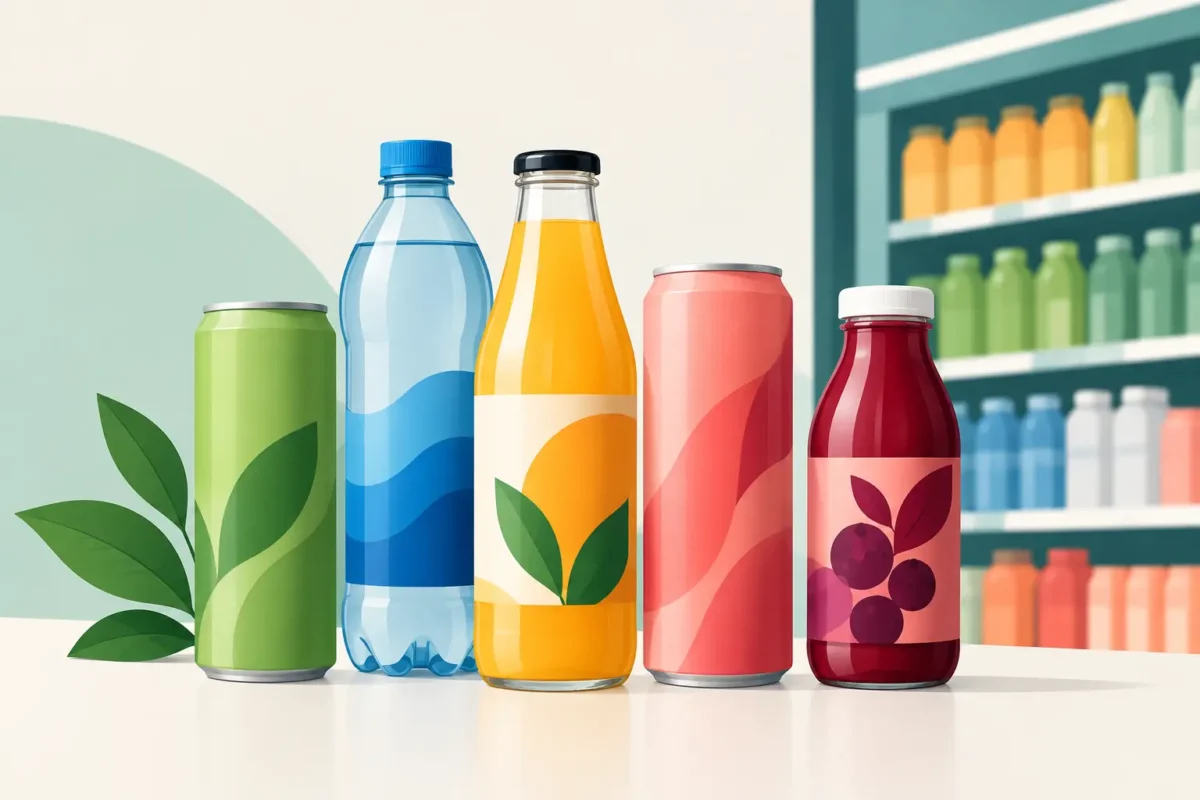
A great drink can still fail before anyone tastes it. If the bottle feels flimsy, the can disappears on the shelf, the label makes an unclear claim, or the case configuration destroys your margin, beverage packaging has become the problem. For ambitious founders, packaging is not the final creative flourish. It is a commercial decision that shapes cost, compliance, manufacturing, distribution and whether a buyer believes your brand deserves space.
Beverage packaging starts with the route to market
The right pack is rarely chosen by asking, “What will look best?” Start with a harder question: where will this drink be bought, consumed and replenished?
A premium functional shot sold at a health retailer has different demands from a 330ml sparkling drink built for convenience stores. A direct-to-consumer subscription can support heavier glass and multipacks, although breakage and postage costs still matter. A product targeting gyms, travel hubs or petrol stations needs portability, fast recognition and a format that works in chilled cabinets.
Retail buyers also think operationally. They want products that stack efficiently, fit existing fixtures, scan cleanly at the till and arrive in cases that do not create hassle for staff. If your pack creates friction in their operation, an attractive brand identity will not save the listing.
This is why packaging must be developed alongside your commercial strategy. Your target retail channel, price point, expected velocity and distribution model should inform the format before design begins.
Choose a format that supports the product
There is no universally best packaging format. Glass, aluminium, PET, cartons and pouches all bring advantages, compromises and supply-chain realities.
Glass can signal quality, natural ingredients and premium provenance. It works well for products where ritual, taste and a more elevated experience are central to the proposition. But it is heavier, more fragile and often more expensive to transport. For a start-up working with tight cash flow, those costs can quickly become significant.
Aluminium cans are lightweight, highly recyclable and well suited to sparkling drinks, energy products and modern functional beverages. They offer excellent shelf visibility and strong convenience credentials. The trade-off is that canning capability, minimum order quantities and decoration choices can influence your launch budget and lead times. If you use sleeved cans, consider the recycling implications and the quality of the finish.
PET offers flexibility, low weight and a familiar format for on-the-go drinks. It can be the practical choice for larger formats, sports hydration and value-led products. Yet founders need to work harder on brand perception if they are aiming for a premium position. Material choice should reinforce what the consumer is paying for, not undermine it.
Cartons and pouches can be compelling for particular use occasions, especially ambient products, family formats or brands with a clear sustainability story. They also introduce specific filling, barrier and recycling considerations. Do not choose an alternative format simply because it appears innovative. Choose it because it serves the drink, the buyer and the business model.
Shelf life and formulation come first
Your formulation and processing method place real limits on pack choice. Acidity, carbonation, light sensitivity, oxygen exposure, hot-fill requirements and product viscosity all affect what will protect the drink properly.
A functional beverage with active ingredients may need protection from light or oxygen to maintain quality over its intended shelf life. A live product has different requirements again. A supplier may be able to source your preferred bottle, but that does not mean it is suitable for your recipe or production process.
This is where early technical input prevents expensive mistakes. A package that looks right but compromises product stability is not fit for purpose.
Build the pack for a three-second decision
Shoppers do not study a drinks shelf like a brand founder studies a pitch deck. They make rapid decisions based on colour, category cues, a benefit they understand and whether the product appears relevant to them.
Your front-of-pack design must answer key questions quickly: what is this, who is it for and why should I choose it? If your drink is a nootropic sparkling beverage, hydration product or gut-health shot, do not make people work to identify the category. Curiosity is useful. Confusion is costly.
The strongest packaging creates a clear hierarchy. The brand should be recognisable, the product descriptor should be legible, and the primary benefit should be credible rather than overclaimed. Everything else is secondary.
Founders often try to fit the entire story on the label: ingredients, founder mission, five benefits, sustainability claims, awards and social proof. The result is visual noise. Your packaging needs discipline. Give the consumer a reason to pick it up, then let the side and back panels do more of the explanatory work.
Design for the real shelf, not just the screen
A beautiful digital mock-up is only the beginning. Test your design at actual pack size, in a crowded fixture and from a realistic viewing distance. Check it alongside direct competitors, not against a blank white background.
Ask whether the name can be read from one metre away. Check whether the colour palette helps the product stand out or makes it blend into the category. Consider how variants work together. A range needs enough consistency to build recognition, but enough differentiation to stop shoppers buying the wrong flavour or function.
Photography, metallic inks, textured finishes and unusual structures can all add impact. They can also add cost, complexity and production risk. Premium does not always mean expensive print effects. Often, it means confident positioning, sharp typography and a pack that communicates with clarity.
Compliance is part of the brand experience
Food and drink labelling is not an administrative task to leave until the end. Mandatory information needs space, and the way it is presented can affect your pack layout from day one.
Depending on the product and market, your label may need to include ingredients, allergen information, nutrition declaration, net quantity, best-before or use-by information, storage instructions, business details, country-of-origin information where required and a suitable lot code. Claims around health, nutrition, energy, vitamins, botanicals or functional benefits demand particular care.
This matters especially in wellness drinks. Language that sounds compelling in a marketing meeting can cross into an unauthorised health claim when printed on pack. “Supports”, “boosts”, “detoxes” and similar terms should never be treated casually. A compliant proposition can still be powerful, but it needs to be built on evidence and the correct wording.
Also plan for barcode placement, deposit-return developments, recycling labelling and any retailer-specific requirements. Small omissions can delay a production run or create costly relabelling work.
Protect margin before committing to print
The most expensive packaging decision is not necessarily the one with the highest unit cost. It is the one that locks you into an unworkable margin at scale.
Calculate the full delivered cost, not just the price of the bottle or can. Include closures, labels or sleeves, outer cases, trays, pallets, freight, storage, filling losses, breakages and any tooling or artwork setup charges. Then test that cost against your wholesale price, retailer margin, promotional spend and distributor terms.
A founder may save a few pence per unit by choosing a cheaper component, only to create a pack that looks weak in premium retail. Equally, spending heavily on a bespoke bottle can make sense only if volume, price point and repeat purchase justify it. The answer depends on your positioning and commercial plan.
Be realistic about minimum order quantities too. Bespoke components can be a powerful brand asset, but they tie up cash and reduce flexibility when forecasts change. Standard formats with distinctive labels, closures or secondary packaging are often the smarter route for an early launch.
Secondary packaging is where operations are won or lost
Consumers see the primary pack. Your supply chain feels the secondary packaging.
Cases need to protect the product through filling, warehousing, palletisation and delivery. They need to be easy to handle, appropriate for the channel and sized efficiently for pallets and retailer back rooms. A case that looks impressive but wastes space can quietly inflate freight costs on every order.
For e-commerce, test the full journey. Does the product survive a courier drop? Does condensation affect the label? Is the unboxing experience consistent with the brand promise? For retail, consider shelf-ready packaging, tray stability and how the product looks when individual units are removed.
At Branding Innovations, packaging development is treated as part of the wider route-to-market plan, because the pack has to work just as hard in a factory, on a pallet and in a buyer meeting as it does on the shelf.
Make decisions in the right order
Packaging projects go wrong when founders approve artwork before resolving technical and commercial fundamentals. A better order is to define the product and target channel, validate the format with manufacturing partners, establish costs and minimums, map legal requirements, then develop the structural and visual design around those realities.
Before signing off, get physical samples in your hands. Test grip, opening, closure performance, readability and durability. Put the product in a fridge. Ship it. Stack it. Show it to people who match your target consumer. These practical checks reveal far more than a polished presentation ever will.
Your drink only gets one first impression with a buyer and a consumer. Build beverage packaging that earns attention, protects the product and leaves enough margin to grow. The cleverest design is the one that gives your brand the best chance of being bought again.